LOGO HISTORY
It happens that the logos, especially the most famous, born almost by accident. Is emblematic the story of Nike’s Swoosh, made for 35 dollars by an art student, has become a true style icon.
Are not you curious to know what lies behind the creation of our logo?
Was it a coincidence or was there a study behind it?
Let’s find out together.
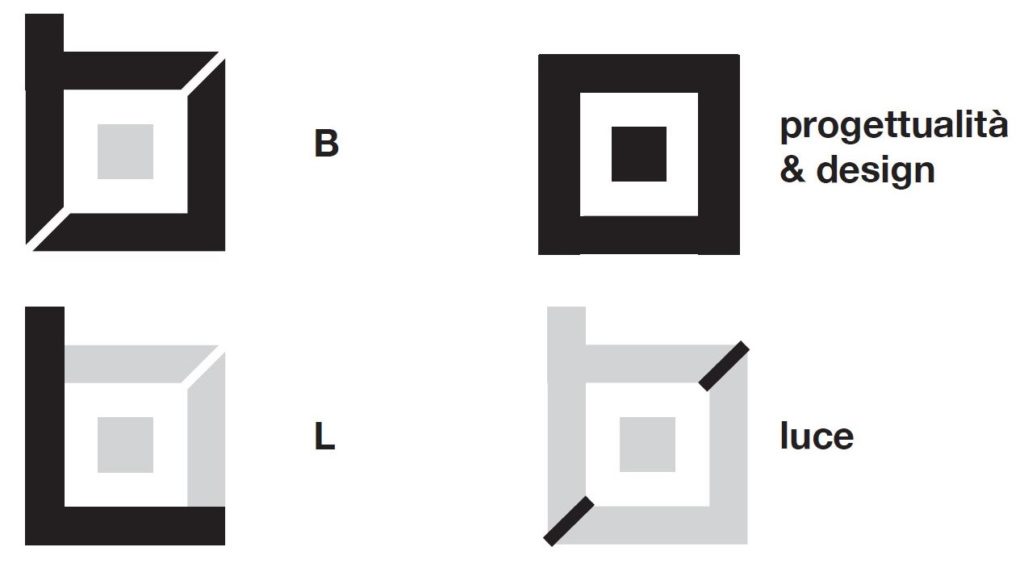
We started from the initials of the company name. Two simple letters that identify all the product codes in our catalog: B and L.
Obviously the graphic representation of the light beam could not be missing.
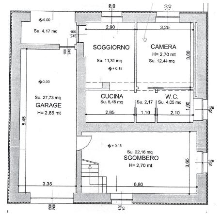
Finally, the final concept came to life in the only geometric shape that could enclose the whole. What shape could be better than an apartment plan? Symbol of planning and design. Why not, maybe the apartment you are renovating in this period?
By composing the various parts, you can see how all the elements of the concept have found their place in our logo.
© Bipaled is a registered trademark (registr. No. 15093404 26/05/2016)


